
Role: Information Architecture, UX Writing, Visual Design, Graphic Design, Research and Testing
Tools: Illustrator, Photoshop, MIRO, Figma
Team: Cynthia Noell, Carrington Smurl, Myself
The Client
Down Home Ranch is a working farm and ranch located in Elgin, TX, that offers social, educational, residential and vocational opportunities to people with intellectual and developmental disabilities. This team project was personal to me because my nephew is on the autism spectrum and I grew up on acreage with cattle myself. I was introduced to the team after another teammate left the class. I brought valuable skills to hit the ground running and finish the project on time.
The Goal
Our client was not very specific on their goals. They wanted improvements throughout the site including better readability, a focus on the Ranchers and an analysis of their product page to help improve online sales.
My goal was to design a visually pleasing prototype that was driven by data research in the time given.
Our team began by conducting a heuristic analysis of the website. This allowed us to see what areas we felt needed focus for user testing. We then were able to create a project plan we felt comfortable completing in a 12-week project. The client approved our project with glowing reviews.
Research Process
One of the areas of improvement was the navigation of the menu items and the homepage. We improvised MIRO to conduct an open card sort to research users who were familiar with organizations like Down Home Ranch to find where improvements were needed.

After organizing the completed card sort activities, we created an affinity map, then gathered insights to help us move to our next step.


Visual Design and Prototype
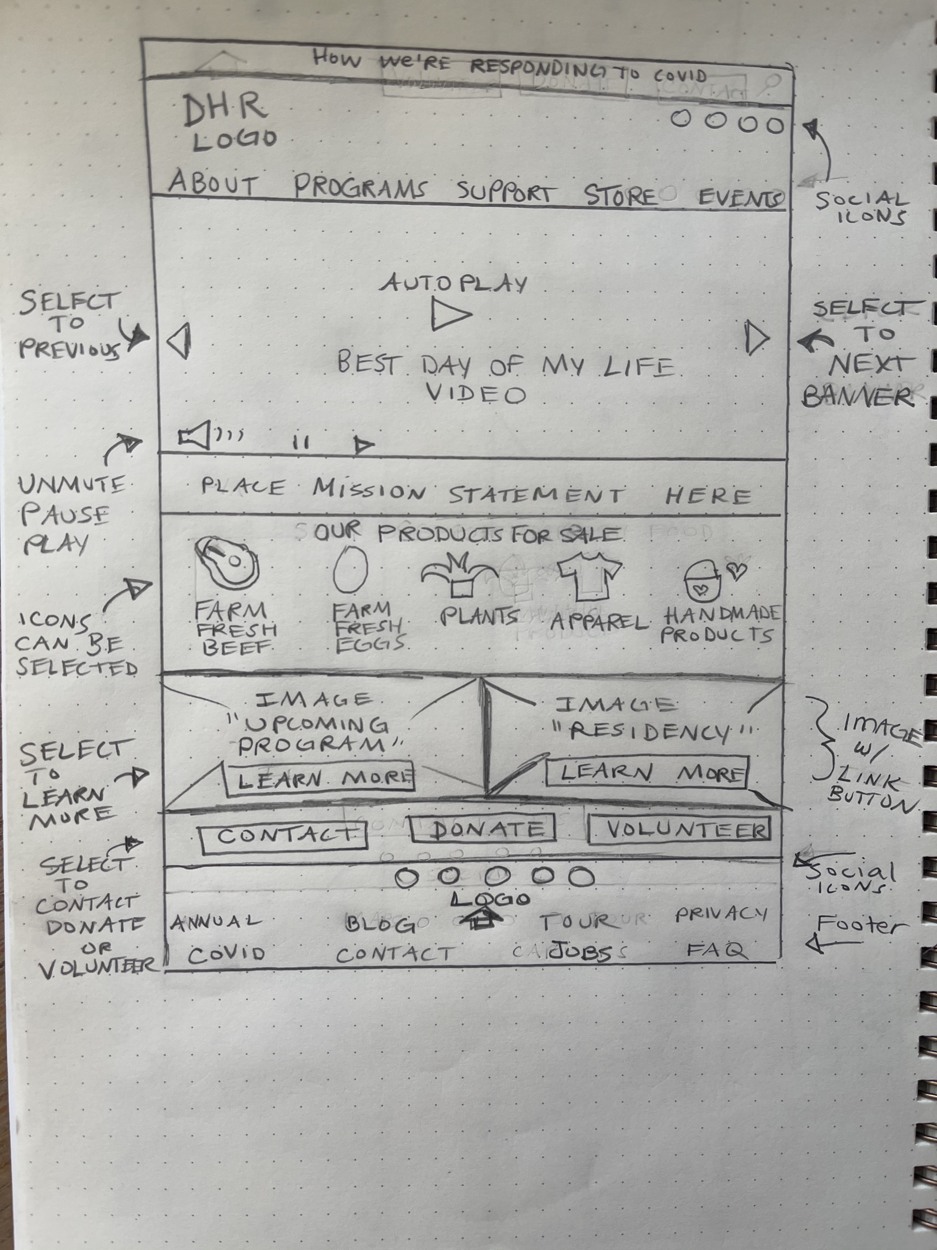
Due to time constraints, we moved from low-fidelity sketches to mid-fidelity prototypes to conduct an A/B test with users. Our tasks included findability testing


Mid-Fidelity Prototypes
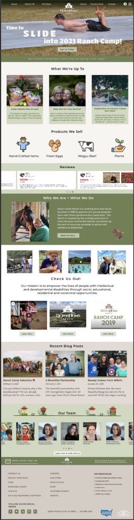
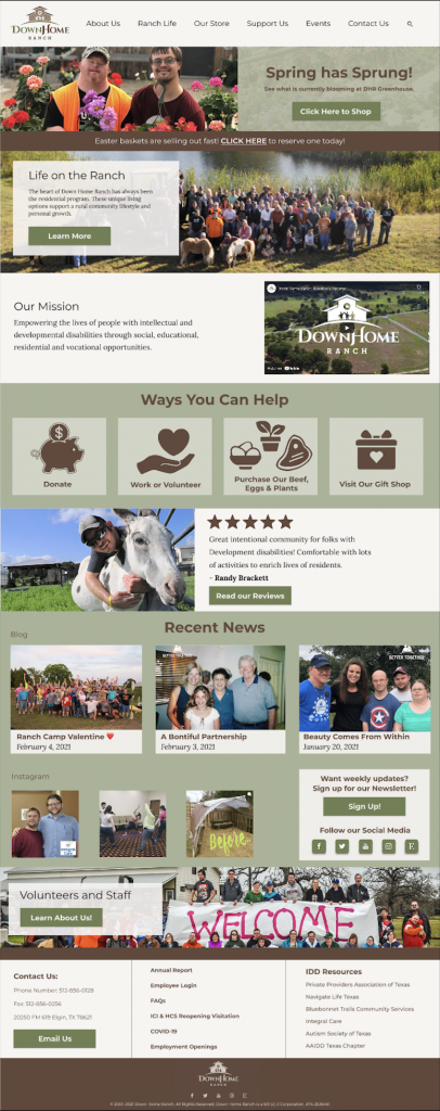
Our mid-fidelity prototypes for A/B testing were based on the original Down Home Ranch website. We included familiar images, colors and type to create two layouts based on our individual sketches. We included similar elements in each with slightly different menu items we wanted to test based on our card sort research.
Final Affinity Mapping
After testing users on the A and B prototypes, we then created an affinity map to organize their positive and negative feedback to then create a final prototype.


Final Prototype
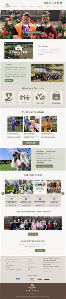
The final prototype I created was based on the positive feedback we gathered from the client and users tested. Pages for the Staff and Ranchers were also created per the client’s request. The site received very positive feedback from the client with an invitation later work on another project.
Heuristic Product Analysis
We also completed an analysis of their product page. Because it was not created on the same platform as their website, we did not include the pages in our redesign however, we gave helpful information on how they could make improvements.
Click to view our Heuristic Product Analysis
Takeaways
Due to time constraints, we were not able to design or test a responsive site to show on different platforms. Moving forward with future projects, this will be made a priority knowing globally 68% of websites are visited on mobile.
This project provided valuable insight into how a real-world project would function in the midst of a team setting. To help ensure consistent progress, I know that using data and research as a basis for design helps create a strong foundation to build upon, and that this should be shared with the client frequently so that collaboration is effectively utilized. Remaining open-minded to others and having confidence in my own knowledge and expertise will strengthen the entire project, as it allows for flexibility while remaining focused on goals. I will carry the lessons I learned with future employers as I continue my UX career, knowing that any group I join will benefit from my knowledge and experience.