Role: Technical Designer, User Research and Testing
Tools: Adobe Xd, MIRO
Team: Aryn, Cheyenne, David,Jenn, Kirsten, Myself
The Challenge
Create an interactive voice UI prototype using Amazon’s Alexa.
Background
Citizens who visualize and plan to vote have a 4.1% higher voter turnout rate on average. Having an engaged verbal conversation encourages potential voters to go through the process in their head and plan for their future vote. Almost every year elections are decided by a single vote.
Problem Statement
How might we increase voter turnout in Texas by helping unregistered Texans learn how to register and complete their voter registration?
The Goal
Learning how to register then to vote can be confusing when scanning through government websites. Our team’s goal was to create a VUI that explains where and how to register to vote by answering a user’s questions quickly and easily. Our goal was to ultimately make registering to vote as simple as a conversation. After important questions were answered, a user would simply fill out a postage-paid form that only needs to be signed and dropped in the mail.
Research
In our research, we found that 21% of eligible voters do not register to vote. A surprising 61% of unregistered voters have never been asked to register. With over 100 million Alexa smart devices sold at the time, we decided to use a device that would more than likely already be in a user’s home.
Approach
Research participants were individuals who are currently not registered to vote or individuals who were registered to vote and had questions, concerns, or difficulties with their registration.
We conducted a total of 5 in-person interviews with 3 unregistered & 2 registered voters. 13 more interviews were later conducted online with 80% registered in their district and 20% not registered; meaning, 20% could not vote where they lived.
Goals
We wanted to learn why people were not registering to vote, and what was preventing them from registering. If the process of registering was easier, would they ultimately register to vote?
Findings
We found that those not registered to vote wanted a more convenient way to register. They also had confusion about the voting process.
Quotes from those interviewed:
“I signed for a house using DocuSign. Why isn’t voter registration as straightforward?”
“I remember we talked about…the right to vote and, like, the history of getting the right to vote, and at what age you can vote, but I don’t think I ever learned how to vote.”
Affinity Mapping and User Personas
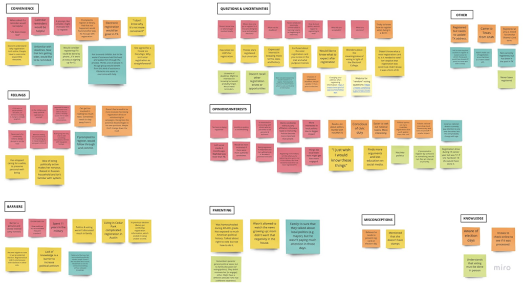
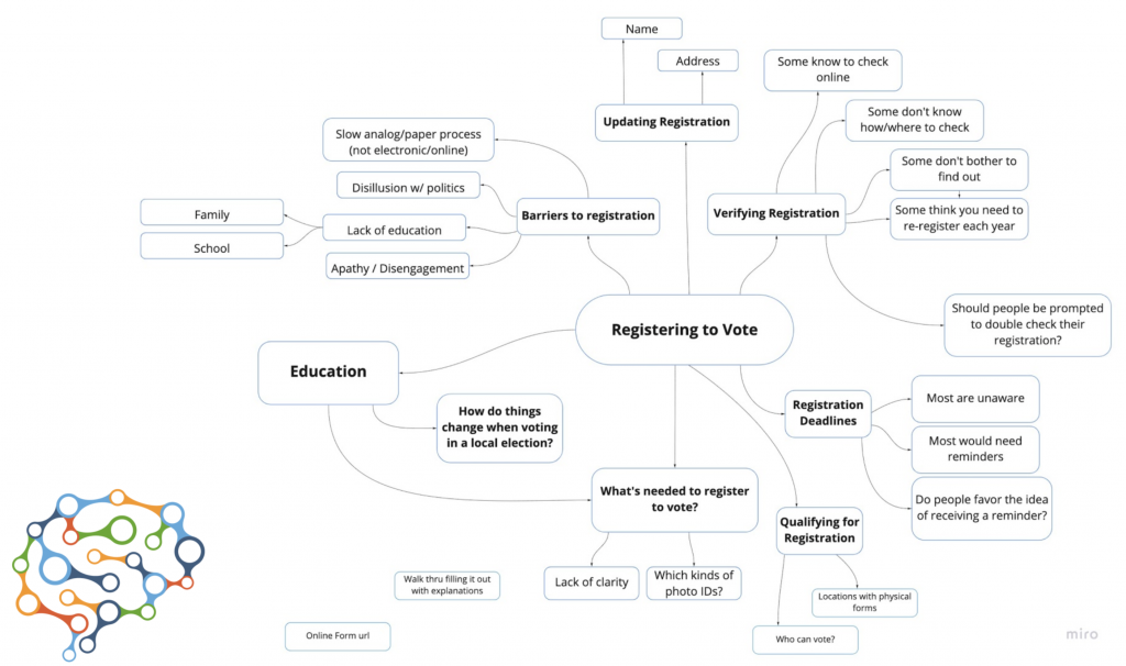
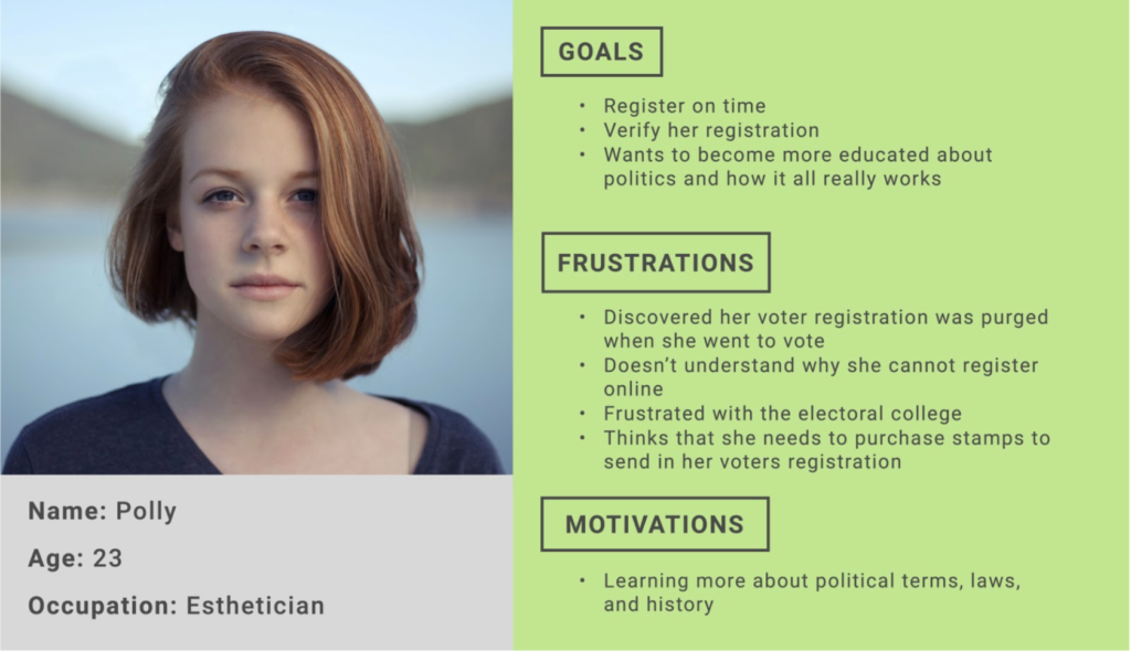
After our initial research, with the help of an affinity map and mind mapping, we were able to build personas focusing on young voters who were over 18, but still not registered to vote. We also discovered we would need to create a persona and “voice” for the Voice UI.
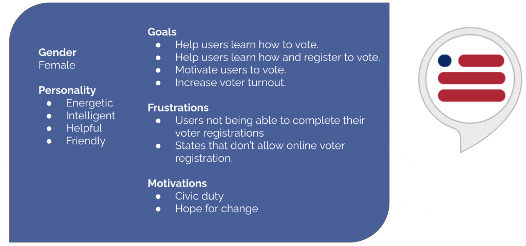
The Voice UI needed a positive personality that was both helpful and motivating.
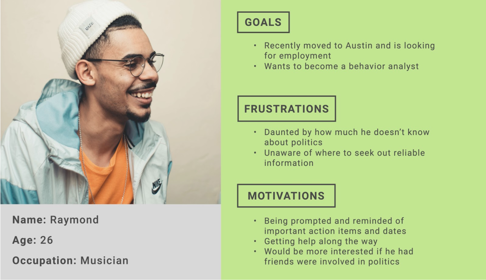
Our personas were young and age-eligible voters who we hoped to educate early to create healthy voting habits for the future.
Conversation Flows
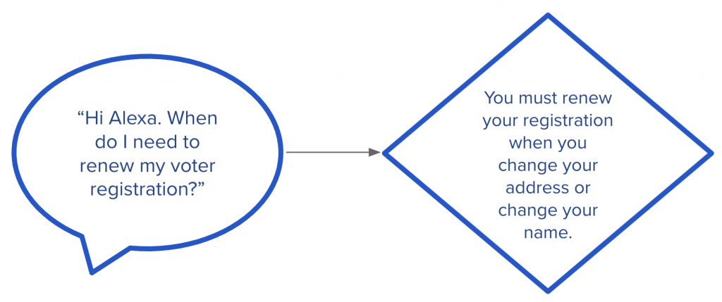
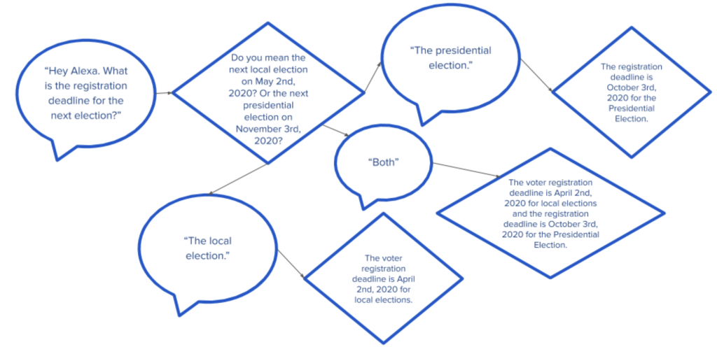
We created conversation flows in order to visualize the conversation process. Direct answers to common questions proved “easy” for the program that included key words the system could register. However, to not “confuse” the voice AI, we developed questions that would have informative answers to yes or no questions. However, I presented the problem that we also needed a path if someone said “both.” We also needed to add common words such as “sure” and “nope” for “yes” and “no.” If these words were not added, the Voice AI would not proceed.
Two view our complete conversation flows, click here.
Prototyping
Approach
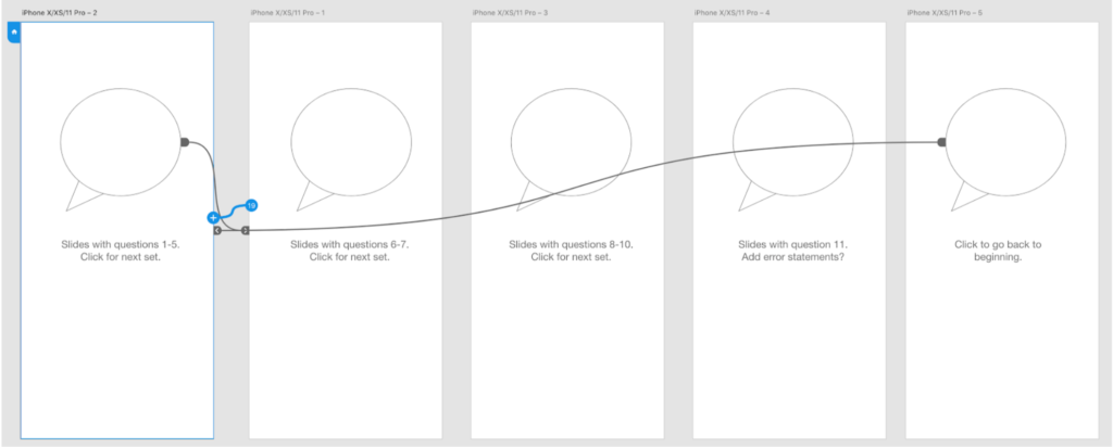
To create the Voice UI, I used a feature in Adobe Xd. The program was readily available and I approached its creation much as I would visual user flows in programs such as Figma or Sketch. The advantage was no coding was needed. However, there were strong limitations on same word usage within a conversation. The conversations needed to be separated into individual statements with corresponding answers in order to test each statement correctly.

Usability Testing
- 3 moderated usability tests of the prototype were conducted (2 in-person, 1 remote).
- Users were walked through 11 different scenarios involving the voter registration process.
It sounds obvious to say that testing a voice user interface is different from testing a visual interface, but I think that one of the aspects that wasn’t inherently obvious was the reduction of internal insight that we get from the user. For instance, when a user is performing a task with their hands, their mouths are free to give us their stream consciousness during use. Unless they tell you immediately what they think before they second guess their thoughts and feelings, you are getting a curated perspective of their experience. This, coupled with several challenges in the actual testing meant that we didn’t get a full sensing of what people actually thought of the product.
Final Prototype
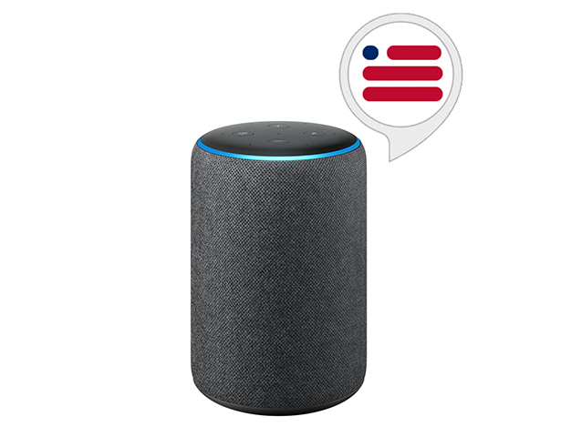
Click the image below to open the Adobe Xd Voice UI prototype. Hold down the space bar to ask or answer each question. Click on the gray circles below the Alexa to proceed to the next question and answer set. Be warned, if you have an Alexa near you, she will wake up!
Commands:
1. Hey Alexa, can I register to vote?
2. Alexa, where can I get a registration form?
3. Hi Alexa. What kinds of ID do I need to register?
4. Hey Alexa. What is the registration deadline for the next election?
5. Hey Alexa. Can I get reminders about upcoming elections?
6. Alexa, where can I get help to register?
7. Alexa, what is this registration card I got in the mail?
8. Alexa, what do I need to bring with me when I vote?
9. I have a felony conviction. Can I vote?
10. Hi Alexa. When do I need to renew my voter registration?
11. Alexa, can I register to vote online?
Takeaways
Designing for a Voice UI was much like designing for a Visual UI project, however the testing proved to be challenging. More research on how to conduct testing is needed to get a better feel how to approach and test users for future projects.
With a larger team for this project, we were able to divide the tasks evenly to turnaround the project in a short matter of time.
Although the Adobe Xd program was simple to use, it had it’s limitations when wanting to ask a series of questions that had the same answers.
Many of the questions we answered did not quite answer the question fully leaving the user confused. More testing to determine better word phrasing is needed.